Casa Leiro
Website redesign
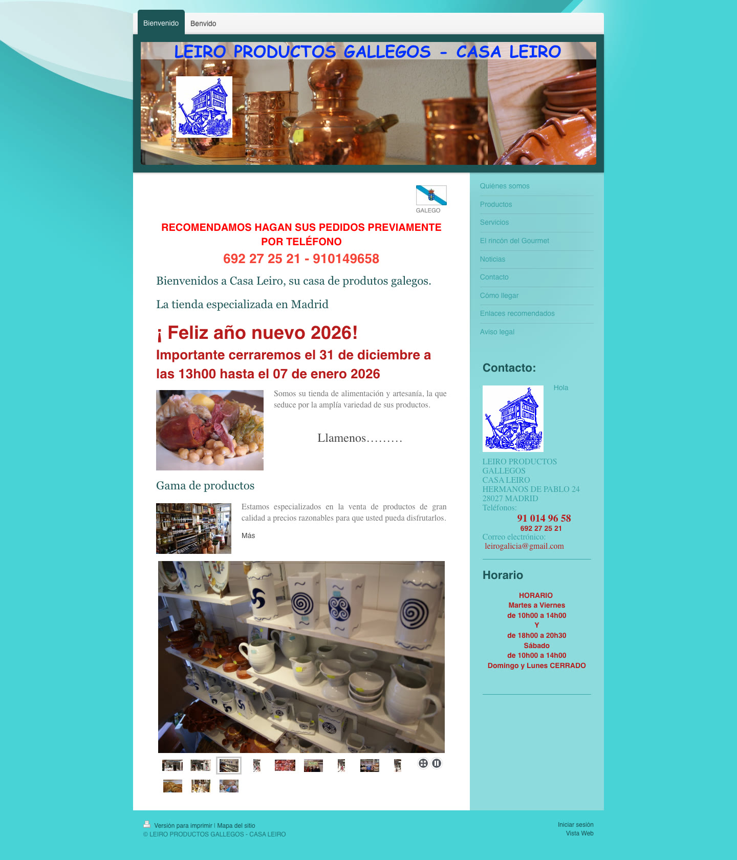
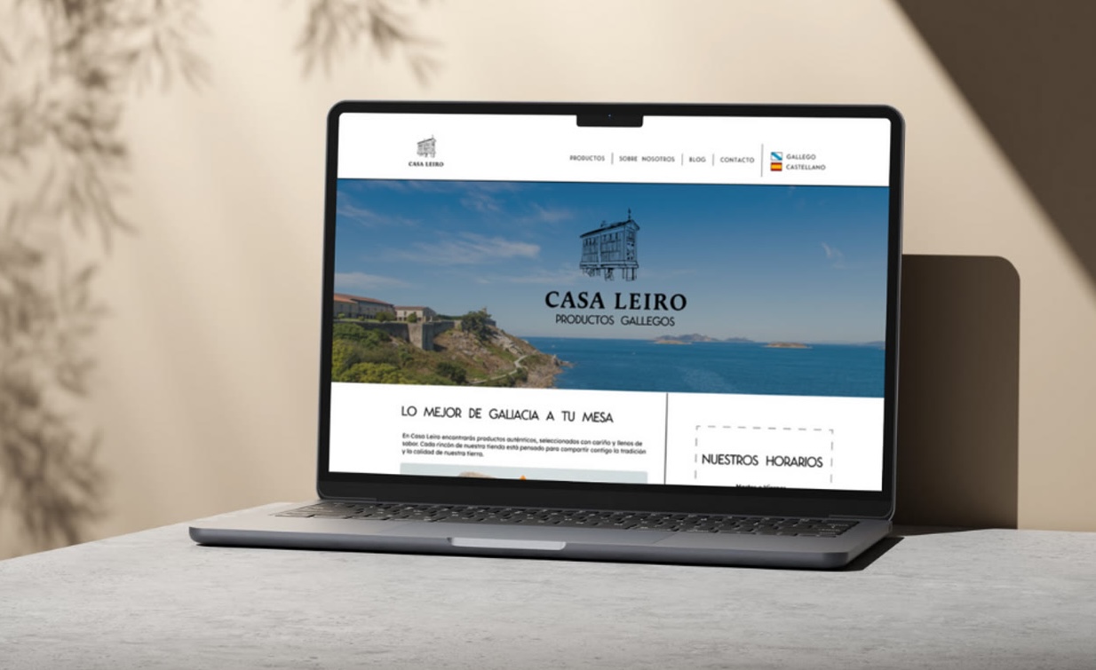
A UX/UI redesign for Casa Leiro, a Madrid shop of Galician specialty products whose site didn’t reflect its quality or authenticity. A heuristic evaluation surfaced broken links, unclear navigation and poor colour contrast; I restructured the information architecture and rebuilt the key pages with a cleaner, warmer visual language rooted in Galician tradition.
The challenge
The site didn’t represent the brand’s quality or authenticity, and several usability issues — inactive links, unintuitive navigation and low colour contrast — hurt both the experience and accessibility.
The approach
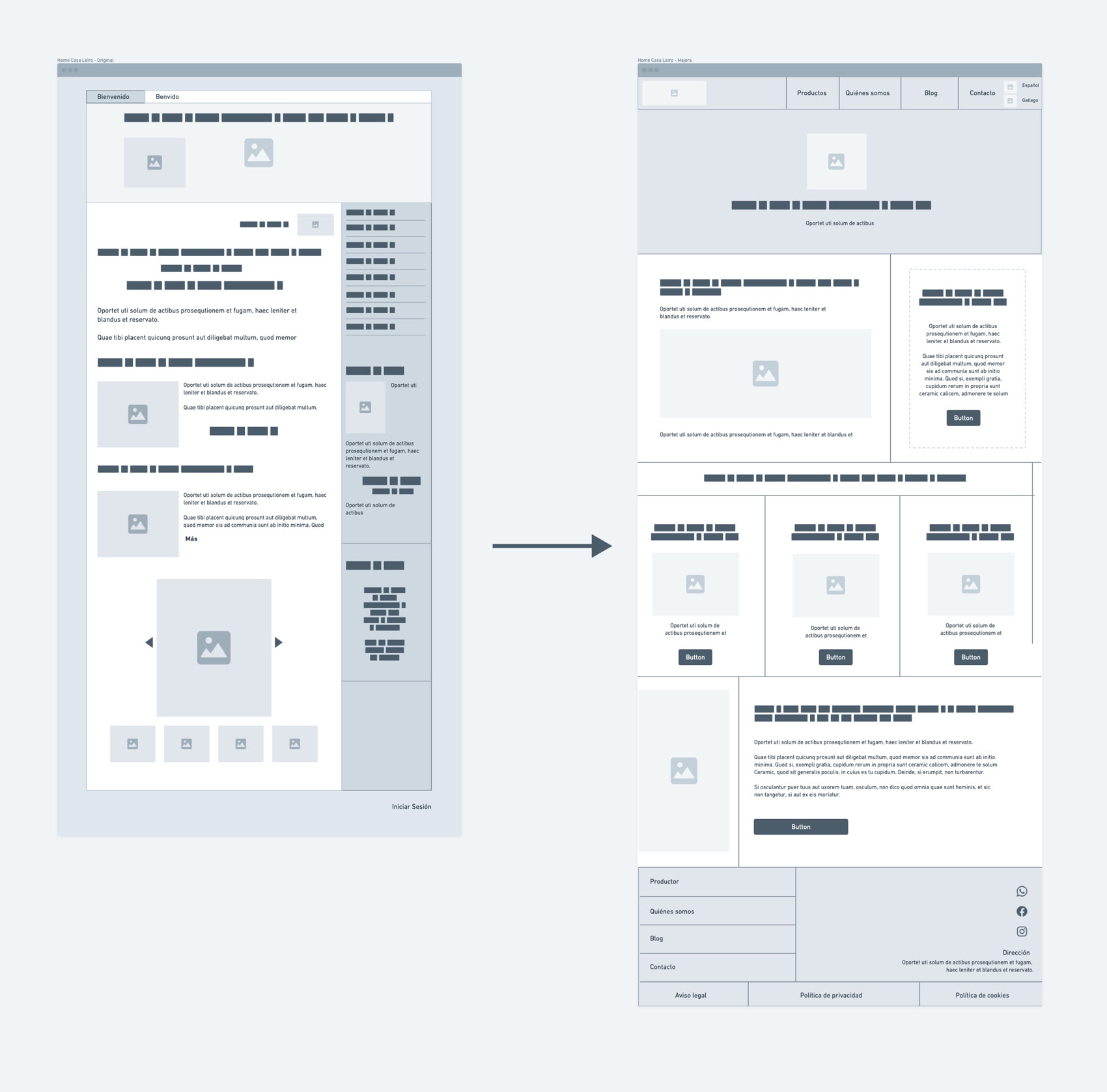
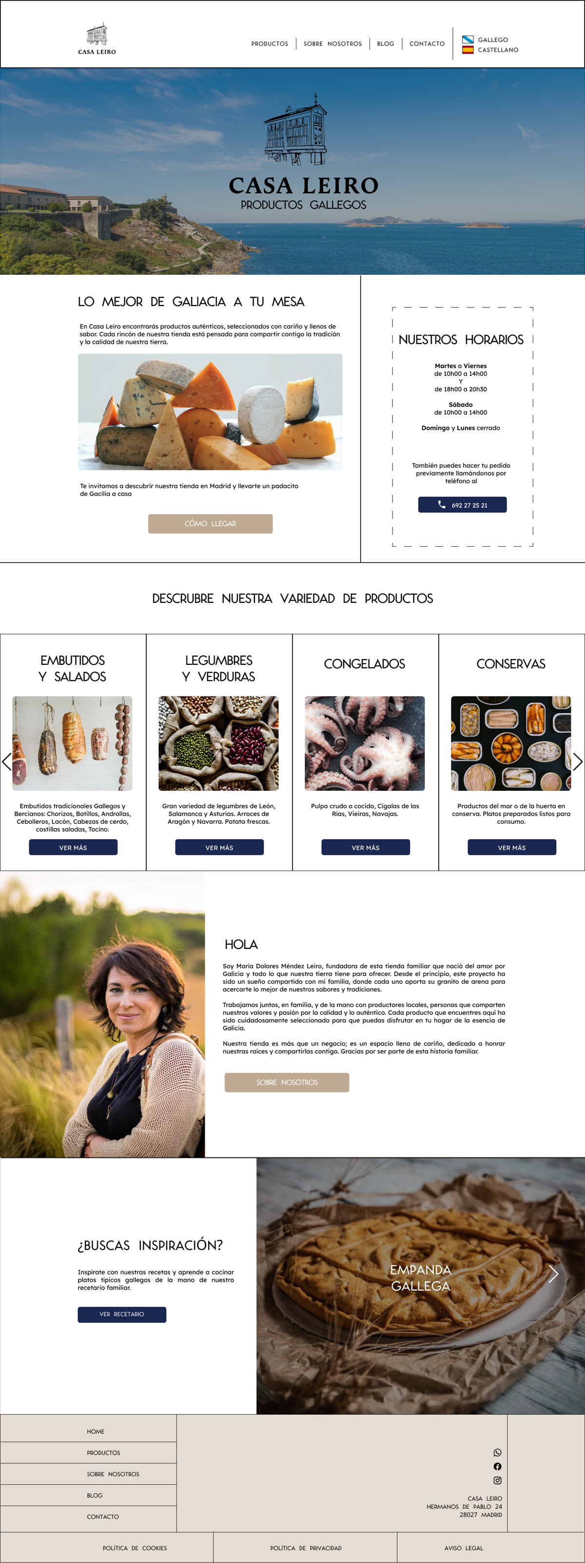
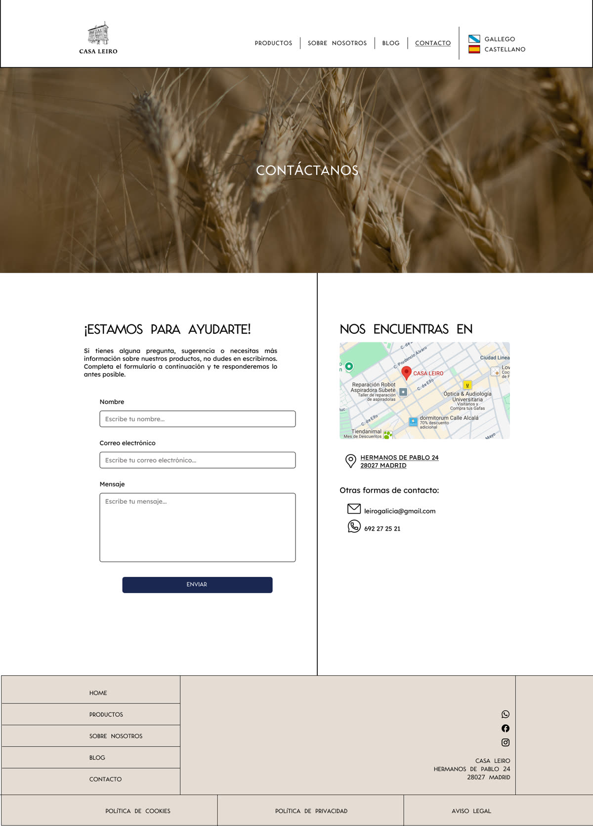
Starting from a heuristic evaluation, I focused on the homepage and contact page: restructured the navigation, applied a clean contemporary aesthetic with quality imagery, and built a warm visual language inspired by Galician and maritime tradition.
Process
01
Heuristic evaluation
Audited usability and accessibility, mapping the broken links, confusing navigation and contrast issues.
02
Information architecture
Restructured the navigation and key pages so the content reads clearly and the path to contact is obvious.
03
Warm visual language
A contemporary aesthetic with quality imagery and accessible contrast, rooted in Galician tradition.
Selected screens